Sunday, October 4, 2009

Black Castle


I finally finished the werewolf I was working on for the last Black Castle Model. The first black castle model was completed over 7 years ago and marked the first of the Confrontation chess pieces I painted (see pic below). The quality of the two are much more similar than the pawn models mentioned three posts down. The big difference is the non metallic metals technique (notice the heavy-yellow gold in the old castle below). The skin and clothes are actually quite similar and there is good reason. I used the wet-blending technique I started 7 years ago instead of the feathering technique that many of my modern models have received. The wet blending technique requires me to keep at least three different shades of paint on the palette at one time as I blend the transitions between the different shades on the model. I stopped using this technique because I often felt rushed when trying to finish before all three+ colors dried out. The feathering technique requires much less haste. Nevertheless, the inconsistent results of the feathering technique have been frustrating and I think this model with be the first of many as I re-explore and improve on my wet-blending technique.

One final note: the dull cote I've come to like has been failing me recently. The last 10+ models have all finished with a much shinier coat than I would like. Subsequent coats do not help and a different spray bottle turned out the same. For the past 10+ years I have been coating the models with a gloss coat followed by a dull coat to get the durability benefits from the gloss coat while the dull coat removes the shine. The next model will forgo the gloss coat for two dull coats as an experiment.

Sunday, September 27, 2009

Yes I am Still Working On the Elves

I know I have been a bit absent in posts lately but I have continued to work on my High Elves. So per the suggestion of Teflon I have tried a elf in gold. I am not sure how I feel about it. The color is definitly warmer and seems to fit the red a bit better, but I am not sure I like it more. I haven't finished the shield yet maybe that will help the overall effect. I am also not completely happy with how my gold turned out. For my first attempt I don't think it is horrible. My next try I think will have more red in the dark parts of the gold. Please let me know what you think.


Painting however has taken up very little of the time I have spent on modeling lately. I have been trying to assemble enough elves to field a decent size army so I can begin playing and learning. This of course involves a ton of cutting, filing, glueing, basing, priming, and adding magnets/metal bits. All of these things turn out to be very time consuming, I am however making progress. As you can see I currently have 20 archers, 20 spearman, 5 silver helms, a war machine, 2 mages, a noble, and 15 swordsmen assembled and primed. There is still alot to go but that is far more then I had a week ago.

I have also created what I think to be a very neat case. I used a plastic tube, like I see many people do. However I made a few improvement. I have added a cookie tray that connects to magnets on the bottom of the bin. This keeps it from sliding around in the bin but allows me to safely place it inside without fear of it moving violently. Additionally I have magnitized all my models to their movement trays or added magnets to the individual models. Additionally I added magnets to the bottom of the movement trays. All of this allows me to attach the completed units to the metal cookie tray, securing them in place. This seems to work pretty well but takes a pretty good amount of effort to setup. If I end up needing more space its only a $6 cookie tray and $4 bin away.


Thats it for now I will let you know how i progress and don't forget to tell me what you think of the gold spearman.
Posted by Picasa

Sunday, September 20, 2009

Descent Minis

Below is two of the first four Descent miniatures I've painted. Descent is a multiplayer dungeon crawl game that plays very similar to the out of print Warhammer: Quest. The game comes with 70 models, 20 of which are unique character models; the rest are monsters. There is nothing fancy about their sculpts, they are made of flexible plastic and they are about half the size of the chess pieces I've been working on. Nevertheless, I find it challenging to attempt to paint each of them quickly (~2hrs) and as close to their description art as possible. The two below have OSL that makes them particularly challenging (glowing sword on first and lantern on second).

I have no idea why all the nice collage pictures I make with Corel Photo Paint get uploaded in the negative colors but it is very frustrating. The images open fine in a jpg viewer but seem to get corrupted during the upload to the blog site. Therefore, I've also added the unmolested images below.


Pawn - Old and New

The last of the White Pawns (five) were completed two weeks ago. Three of the eight pawns were actually painted seven years ago when I initially started the chess set and was just learning the Non-Metallic Metal (NMM) technique. The above picture shows one of the original pawns on the left, with a newly painted pawn in the same pose on the right. I tried to keep the reds and whites as similar as possible so they wouldn't clash on the chess board. Nevertheless, its obvious there are differences. The red from the old pawn was shaded with washes rather than a deliberate application of dark red in the recesses, as with the new pawn. This new technique takes longer but makes a cleaner look. The ab muscles on each mini illustrate this difference the best. The whites are actually quite similar even though I used Foundation paint for the brown and dark yellow shading. This is one of the rare instances where my new technique is actually quicker than my old (even though all thanks go to new paint technology and not my skill). The NMM gold and steel are where the models differ the most. The old style has too little contrast and way too much orange in the gold. The steel also lacks the high contrast (e.g. very dark gray/black in the areas the do not reflect toward your eye) and does not put the bright highlights in the appropriate glint points on the sword. I may go back and repaint the metals on the old ones to match.
The second werewolf (Black Castle) model is on the painting stand. Unfortunately, I've been distracted by the desire to paint the minis that come with the dungeon crawl board game Descent. Therefore, he has been sitting there for two weeks with nothing more than black primer. I have no idea when I'll get around to working on him.

Sunday, August 30, 2009

Black Knight Chess Piece 2

Just finished the second Knight for the Black team. I think the gold on this model turned out more realistic than the previous night. I allowed more of the orange to show and I used brown with less red in it for the darkest shadows. Black is left in the deepest shadows and white glints are added to wherever I think they would be appropriated.
The GW Foundation paint experiment I mentioned from last post was useful. Blending with "bubonic brown" (normal acrylic), instead of "Iyandan Yellow" (foundation line) did create a nicer fade. Therefore, I will be avoiding foundation paints for all layered blends unless I see strong evidence to prove that it is superior.
Next up is the White Pawns--which happen to be human knights on foot. I plan to paint several at a time, so it's unlikely they've been done by next weekend.

Sunday, August 23, 2009

Black Knight Chess Piece 1

Just finished the first of two skeleton centaurs to represent the Knights on the Black team of the chess board. I love this model but I'm disappointed with my paint job even though I can't pinpoint a specific reason. I think the bones turned out well. The NMM on the armor is OK. It may be the gold NMM that I don't like...but I'm not sure if I don't like the color of it, or it just doesn't fit well on this model (especially on the helmet).
Even though the bones turned out well, I'm concerned about using GW foundation paints for blending. They have this strange phenomenon of drying more opaque then they were applied. Although this is great for creating a base coat, it seems to ruin a well layered blend. On the next model, I will try using the GW "Tau Sept Ocre" as the base but do all the highlighting with regular (non-Foundation) paints to test for differences.

Thursday, August 20, 2009

High Elf Spearman With Shield

Got the shield done, figured I would post it. Sorry the pics aren't has good Kelly has the good camera tonight.


Posted by Picasa

Wednesday, August 19, 2009

High Elf Spearman Prototype

Well I finally got around to painting my first High Elf. I have decided to go with a red based scheme for this army. The following pictures are my test subject for this color scheme. This guy will eventually have shield when completed but it was easier to paint the body without it. Let me know what you think.


Posted by Picasa

Monday, August 17, 2009

Bishop Chess Piece 2


I just finished the second Confrontation mini to represent one of my "white" Bishop chess pieces. Due to the dull reds and whites from last week's Bishop model, I put a bit more attention into these colors. For the white, I spent several additional layers blending up from light brown to white and let the white fall on more of the surface than just the highest raised portions. The highlight for the last bishop model used the GW foundation with varying degrees of bleach bone mixed in and it ended up looking faded. This model used reds with increasing amounts of orange mixed in on the highlights. It creates a much bolder look that I like. Unfortunately, this model sticks out a bit when compared to his earlier-painted team mates.

Sunday, August 9, 2009

Bishop Chess Piece


On the heels of 'Ard Boyz and the Necro, I have decided to take a bit of time off from playing and just focus on painting. To that end, I've returned to my Confrontation Chess Set project. Beginning nearly 9 years ago, I had decided to paint a chess set using various minatures from the Confrontation minatures line. The "white" side would be composeded of on-foot knights for pawns, mounted knights for knights, wizards for bishops, and minotaurs for castles. The "black" side would use sketons for pawns, skeleton centaurs for knights, winged wraiths for bishops, and werewolves for castles. The pic below is my most recent addition and the first bishop model. This model was a refreshing change from the scifi models I have been painting for the past two year as there were no armor plates and not a single 'hardline' to be made. I also welcomed the chance to practice my OSL skills again using the candle on the top of the stack of books. I think it turned out pretty good with a couple of areas for improvement. The red looks a bit dull to me and the off-white sash is not white enough. Bishop number two is on the paiting stick now and I'll try to correct the oversights with this one.

Wednesday, July 29, 2009

Player's Choice Awards

During The Necronomicon last weekend, the Hardliners were pleasantly surprised when our own Tog was awarded “40K Player’s Choice” awards in the unit and army category with his wonderfully highlighted Tau. When it came to painting, his army was easily in the top 5 (out of 70) armies present. However, it would be hard to say that it was number one. This phenomenon is not an isolated case; as I’ve been to several tournaments where the best painted models (as determined by color selection, technical proficiency, and technique difficulty) did not win the award. There always appears to be an aspect of the winning model, beyond skillful paint application, that makes it rise to the top. The below discussion is my exposition on the “Player’s Choice Award” based on observations of miniature appearance competitions for the last 10 years.

First of all, the evaluation of painted miniatures is subjective. In the absence of specific grading criteria (which is often the case), judges will grade a model in a similar manner as a fine work of art; which is based on numerous categories of personally-appreciated aesthetics. Although I think it is impossible to define criteria by which one can predict the allure of one fine work of art over another, I do think it is [much more] possible to create a set of rules that can closely approximate the appeal of one army/figure over another due to the shared subject matter, media, and audience demographic in miniature wargame modeling.

If painting skill only distills the list of competitors to the top 5%, what aspects of the model or army make it more compelling?

1. The army/figure must grab your attention from a distance. Sometimes this is difficult because, by their nature, miniatures are small. I have noticed these four techniques used effectively:
a) Use large models (such as vehicles, monstrous creatures, giant banners)
b) Stage your model(s) on a large and/or decorative base (e.g. plinth for single models, elaborate movement trays for units, or dioramas for armies)
c) Use bright colors
d) Paint the model(s) with a high degree of contrast

2. The army/figure should look unique. Of course, the technique that is used to achieve uniqueness must still be appealing and appropriate. I have noticed several ways to achieve this aspect:
a) Use a rare model (e.g. special edition release, out of print, one-of-a-kind sculpts, etc)
b) Significantly modify a common model (e.g. combine parts from several models, sculpt changes, etc)
c) Combine models from different genres (e.g. use raptors to represent jet bikes, etc)
d) Paint the models in a manner that is rarely seen (e.g. Non-metallic metal, complex blending, monochromatic, etc)

There ya go! Two rules that sound simple yet can be followed in an infinite number of ways. Obviously, I’m suggesting that the viewers need to be “wow’d” by the models as well as impressed by the painting. Furthermore, I propose that it is the modeler that is most talented in his application of these two rules (which involves more than just painting) that most often wins the “Player’s Choice” award.

One parting question for the readers (assuming you mostly agree with my ideas): Do you think that an army/model’s chances of winning Player’s Choice go down if the audience has already seen the model(s) before (i.e. from a webpage, previous competition, etc) since some of the “wow factor” was been reduced?

Monday, July 27, 2009

2009 Necronomicon Pictures

I did not get as many pictures as I should have, but here is what I have. Hope you guys enjoy.

Necronomicon 2009

Thursday, July 9, 2009

Necro Display Base Day #6 - Complete!!

Well after some work I have added the final touches to the project. In the first two pictures you will see some static grass that was added to give the terrain contrast. This is consistent with the basing on my models.


I then added trim to the edges to give the base a finished look. This should not only make the base look better but add support and protection for fragile foam edges.


Finally the army on the base. Almost like they are on their home planet! :)


That completes this project. A few more models to finish and I am ready for the event. Only 3 weeks to go!
Posted by Picasa

Wednesday, July 8, 2009

Eldar Necro Display Base

Like Tog, I recently completed my army display base for the Necronomicon this week. Unlike Tog, I had the constraint that it had to fit in my luggage. Therefore, mine is smaller, less elaborate and includes no free space for decorative terrain or structures. Nevertheless, I'm pleased with the results. Below is a quick look at the progress through the major stages:

Step 1. Map out the proposed placement for the models. I was going for a simple stair-step piece so it just made sense to put the tall models in the back and the harlequins up front. Fortunately, the squad size and structure of my army made for a very balanced look with two tanks and two jet bike squads on either side and the littler squads spread evenly out front. The Farseer would fall in the center of it all but needed some sort of raised platform to give him the attention he required.Step 2. Cutting the cork. I used cork to represent layered rock on several of my character pieces in the army so I found it only fitting to use it for the overall base. I like how the torn edges of cork create a very natural looking rocky edge effect and this step did not take a great deal of time.

Step 3. Adding the sandy ballast, small boulders, and the rocky outcrop for the Farseer to stand on. The sand was added to create additional texture to the piece. I imagined the eroding of the rock edges to create small pepples and sand so that dictated its placement. Small boulders were also added from cork "crumbles" left over during the tearing of the large cork sheets. The stand for the Farseer is simply several layers of cork stacked on top of each other.

>Step 4. Coloring. The bases on all of my Eldar resemble sandy or rocky ground covered in snow. The display base was painted to exactly match that. It started with a heafty base coat of black (I used spray paint to save time and get a nice flat coat that didn't cover any of the cork's texture). Next, I dry brushed it with a pewter gray followed by two more layers of progressively lighter shades of gray. I was careful to catch the sharp, torn edges of the cork with the paintbrush to ensure the rocky-look was accentuated. I think it worked.

Step 5. Let it snow. I used the same snow technique I've been using on all of my models' bases. Its simply watered-down and spread-out whipped spackle. The actual name of the product is Foam Putty but I have a small bucket of whipped spackle that looks, feels, and smells just like it. In any case, I throw a glob on the base in various places and smooth it out by watering it down and spreading it with a wet knife. When it dries, it looks like a snow drift.

Viola! The base is complete and the models don't fall over. I saved the neatest part for last. The foundation for this base is actually a breakfast in bed tray that can be purchased fairly cheaply ($13) from Bed, Bath, and Beyond. It has fold-out legs that (a) allow it to fit neatly in my suitcase, (b) bring the models closer to eye level for viewing, and (c) can be positiong over the terrain on the game table so you don't need to move the terrain out of the way to lay it down between games. Unfortunately, I cannot claim credit for this idea. A couple of players shared this solution with me at last year's Baltimore GT when they saw that i was moving my army around on an old, burnt cookie sheet.

Monday, July 6, 2009

Necro Display Base Day #4

Well I made some good progress today. I found that the humidity does not seem to effect the acrylics paints as much when they are used at full strength which is necessary when dry bushing. Because the paint was able to dry faster today I made a lot of progress as you can see below.

As can be seen I applied a lighter brown on top of the dark brown/black base coat to give the shadow layer more warmth.


I then applied a yellowish brown similar to the tau cept ochre foundation paint to bring the base color closer to the sand color you would expect for the tau home world.


Finally I highlighted with a bone white color to accent the sand. This is very similar to the theme used when basing my main army.


After that final highlight was completed you can see the final product. I think it turned out pretty well.


Tomorrow I will give the whole thing a coat of thinned down glue to seal everything and then apply some static grass to add some additional depth. The whole thing will be finished off with black trim. I should have the final product ready by Wednesday. I will post and update then.
Posted by Picasa

Sunday, July 5, 2009

Necro Display Base Day #3

So it turns out glue takes a lot longer to dry in 80% humidity then I had originally expected. Because of this I didn't get everything glued until this morning :( Good news is I got to move forward today. The following picture shows the gravel/sand I applied to give the base that desert feel. I had a little bit of trouble getting the glue to stick. The Styrofoam is very slick on the smooth parts and the glue does not like to stay put. Good news is it seems to have dried well.


Next I based with a mixture of black, dark brown, and some glue to insure that the gravel would stay put after the paint was applied. This turned out to also be a very long process as the paint had the same problem with the Styrofoam as the glue did. Patience seems to have gotten the job done.


I will most likely apply a second coat after the drying is complete. A good night of drying for the base coat and I should be able to get a few more colors on tomorrow. My biggest worries at the moment are whether the paint will stick properly once it is dry. I will likely coat the whole thing with thinned down glue in the end to give a lacuer like coat.


More to come...
Posted by Picasa

Friday, July 3, 2009

Necro Display Base Day #1


Well I finally got around to starting my display base for The Necro 2009. I have decided to got with a desert feel as it goes well with the traditional Tau colors I used for my army. I started with just a piece of foam core for the base and began to build up from there. As you can see I went with blue high density Styrofoam.


I got to use for the first time my foam cutter. The thing works like a charm, cuts through the foam like a hot knife through butter.


Finally here is the mockup for the back portion of the board.

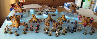
Here is my test placement of my army. Looks pretty good I think. I did end up having to added a little more height in the back to make it look right, but I forgot to grab a picture.


Well that's it for today. Tomorrow more gluing and paint! :)
Posted by Picasa