Unlike other dungeon crawling games like Descent or Warhammer Quest; Super Dungeon Explore uses large square dungeon tiles, that fit flush together along their edge, to represented the layout of the dungeon. Descent and Quest use irregular shapes that often touch only a few neighboring pieces so the negative spaces between the tiles represent walls or null zones that the characters cannot move or see through. On the SDE boards, the walls and such are drawn onto the map.Unfortunately, they are not always easy to see and determining line of sight and movement paths can be tricky. I am not the first and only person to feel this way, nor the first person who thought it might be fun to fix that problem by adding 3 dimensional features on the board to represent the sight-blocking nature of the room's objects. The following link shows one of the more extreme examples; where the maps have been completely recreated with painted plaster terrain: tabletopgeeks .
Although I thought it would be fun to explore the wonderful world of mass plaster production, I still have 30+ more models to paint and a host of other projects that also want my attention. Therefore, I selected a solution somewhere in the middle. I continue to use the colorful cardboard tiles, but I have recreated the 3-dimensional elements with carved and painted polystyrene foam. The foam took about 26 hours to shape and 10 hours to paint.
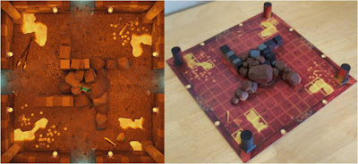
The pictures below show the hot wire cutter I used to cut the straight geometrical shapes. A tinfoil ball rolled over the surface of the foam was used to create a stone-like texture. The bricks and other shapes were made with a very sharp exaco knife. Inexpensive acrylic craft paints were dry-brushed on for the color. The other pictures show the final outcome of the more interesting map sections. A picture of the map's art is given on the left side of each image for reference. Recreating the illumination of the lava and crystals from the map onto the 3D parts was a lot of fun. The final picture shows an example of each of the three wall connectors used between the map tiles to mark the dividing walls. I left them modular to allow for variable shape combinations among the tiles.


No comments:
Post a Comment