Sunday, December 12, 2010

Dark Eldar Wych Hekatrix


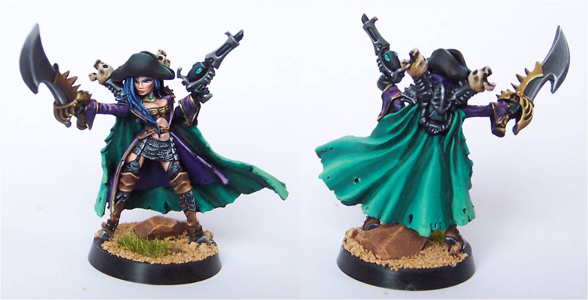
I just finished the squad leader for my first unit of wyches. If you don't remember seeing this model advertised in White Dwarf, there is good reason. I have decided to model my wych squads with miniatures from the Warmachine line. Although GW did a much better job on their DE models this go around, I think their wych models look a little too butch. They intended the male/female heads/torsos to be interchangeable with the arms and legs and it does not work well. The arms and legs are very masculine and doesn't look good with the female bits. I found the above character model and a pair of squads under the Cryx line of Warmachine. One small problem is that they came with horns growing out of their heads, however, they are much more pirate-y. The above character has had the horns removed and a bicorn pirate hat sculpted over the holes. I have also added a pistol from the DE line to her left hand. Since the squad members won't be getting hats, I will have to cut off the horns and re sculpt the forehead and hair.
In the past, I was very hesitant to add non-GW parts to my army because the options were not pretty and GW would not allow them in their tournaments. The flood of new and talented companies to the market and the fact that GW no longer sponsors tournaments has removed those concerns.

Sunday, December 5, 2010

Dark Eldar Pirate Ship


I finally finished my first Dark Eldar Raider and I have to admit that I'm a little disappointed. First of all, this was a very difficult model to paint due to all of the hard lines that had to be covered and the fact that it had to remain almost entirely disassembled during the entire painting process. Second, it ended up being a dark model even though I tried to mitigate this effect through high contrast. Third, the model is just not as sleek as the Eldar Wave Serpents I'm used to painting.
The blue to purple fade seems to have worked fairly well on the hull. I plan to repeat this theme on all the Raiders and use a blue to green fade on the Ravagers.
The original plan for the sails included a pair of masts with double sails but it turned out to be crowded when I put them in place. The gunner in the front was almost completely obscuring the art on the lower sail, so I decided to break them apart and only use the single mast, centered in the deck. I think I will go back to the two-mast design on the Ravager, to set them apart from the Raiders. However, I won't put art on the lower sails.
I think I'm going to move to troops for while, before returning to the vehicles. Next up, the wyches.

Sunday, November 21, 2010

Blood Angels Sanguinary Priest 2

I've been continuing to experiment with white. On this Apothecary, I used a light gray as the base color, with white highlights. I was concerned that it would turn out too dark, but it seems like it works out okay. Jen wants me to try using bone color as the base, but I'm afraid that it will make them look like Deathwing...

Thursday, November 11, 2010

Eldar Pirate Captain


Here is the second model I acquired for my nautical/pirate themed army prior to the actual release of the Dark Eldar. It is a special character from the Dark Elves army (fantasy) that I intend to use as a squad leader. The squad will be a mix of parts from the new Dark Eldar warrior and the Dark Elf corsair models.
Of particular note; this model marks my first attempt at crystal swords. The instructions in WD 361 sounded very simple but were anything but during execution. The technique requires a lot of frequent, quick transition blends between extreme shades of color which were very hard to do on such a small surface area. Despite several redo-s, I'm happy with the results.
The base is supposed to look like the wooden planks from a ship and were actually made with wooden craft sticks that I "weathered" and stained with brown ink. The chain is from a necklace chain that I superglued together (to keep it from moving around) and then painted.
Although I like this model and feel it came out pretty good, I'm concerned by how dark it is. If all the models in my army come out this dark, it will not have the "pop" required to distinguish it from any other army; even if I did a good job at applying the paint. In essence, I need to stay away from black as much as possible and make sure my colored bits have extreme amounts of contrast.

Monday, November 8, 2010

Blood Angels Land Raider

I've been busy building up my Blood Angels army, and I couldn't resist the temptation of a flying Land Raider. I'm probably going to have to add one of the Land Raider variants at some point.


I didn't do a lot of customizing. This is the largest thing I've painted, so I was a little intimidated. I did add some bullet holes to the starboard side, and some weathering/damage to some of the leading edges (you know, from hard landings and such).

Sunday, October 24, 2010

Eldar Pirate - Part Two

So, the paint job on the Pirate Lord is complete. I thought the sword looked big in the green-stuff stage, but it looks even bigger painted. I like it. Below is the image I used for the inspiration on the color scheme. I wanted a stormy seas and cartoon look.
I originally wanted to avoid black in this army since I think it lacks depth (since you can't shade it) but I couldn't imagine pirates without a healthy amount of black. As a compromise, I decided to go ahead and include black, but highlight with color (in this case blue) rather than the usually shades of gray. As with the Eldar, I'm sticking with the Non Metallic Metals. To kick up the painting a notch, I've decided to include color transitions in the highlights. For example; rather than blue highlighting to light blue, it will fade to a purple (see back of cloak). Below are the before and after shots. I still need to make a suitably fancy base to call this model complete.

Monday, October 11, 2010

Eldar-rrgh Pirates!

The Dark Eldar models are now available for advanced order and they are very attractive (http://www.games-workshop.com/gws/catalog/armySubUnitCats.jsp?catId=cat440160a&rootCatGameStyle=) . I intend to use these models, their new rules, and their hit and run nature as a basis for an Eldar Pirate army I've been contemplating for a while. The look of their new transports (Raider pic from GW web page below) make me both happy and sad. I was going to add sails to the models to match my pirate theme, but they've apparently beaten me to it. I'm happy they did such a splendid job on them, but I'm sad that I will no longer have that unique sail-look.

The actual composition of my army will include some of the DE models and some modified Eldar models. For example, I intend to use the Eldar ranger models for the base troops because I like the look of the long coats and loose clothes. Additionally, I wanted to do something special for the lord character that had a look of Eldar-gone-rogue. The plan was to merge an Eldar Farseer model with an empire noble model, add an elf head, and sculpt him a fancy tricorn hat and buccaneer sword. The images below show how the plan unfolded this weekend.

The messiest part of this project was the preparation of the metal Farseer and metal noble models. In the Farseer's case, I was lucky that the head model was not part of the main model but I still had to remove his skirt, below the belt (which is going to be replaced by the noble's legs). This required some precise grinding with the dremel tool for about an hour. The only thing I needed from the noble were his legs and his surgery was completed entirely with a hobby saw and exacto knife.The sculpting of the cutlass and tricorn were a blast. The cutlass is made mostly from plasticard that I shaped using the dremel's grinding wheel attachment. The tricorn hat was surprisingly easy and actually took me less than ten minutes. The base shape of a tricorn (or bicorn) hat is actually a circle. After sculpting an appropriately sized flat circle, I simply pressed it down over the top of the head and folded it up on three sides.
The next post will include this model fully painted and will demonstrate the color theme I intend to use for the army.

Wednesday, September 8, 2010

Another Eldar Tank

So these posts are a bit out of order. I painted this tank just before the NOVA open in August. The tournament before that, the ICGT, proved to me the value of mechanization and I meant to fixed that gap in my army. I hope to add another Wave Serpent to my army soon as well as beef up and double my jet bike squads (see blue jet bike in previous post). I've even been toying with the idea of a second, three-strong squad of war walkers. I don't really like the paint job on the current ones and my 'Ard Boyz list for 2011 requires six :-)I think this model turned out quite nice but a little dark. When compared to my early tanks, it is noticeable a shade darker. Next to the newer, glowy Fire Prism, they are about the same. This model also fell victim to a phenomenon that was slow to recognize but is now undeniable--varnish will change the color of your paint job. Sometimes it is nice, because it tends to bend together fades and hides the brush strokes. Unfortunately, it can also dull and darken the highlights. After spraying this model I had to go back and repaint all of the hard lines. I wish I had taken a "before" shot to show the difference. BTW: the same problem occurred with the Black Queen and I had to repaint her skin and hair highlights. I switched to a new can of varnish before coating the most recently painted jet bike. The fading is less obvious on this one.

A small break for Chess

While drooling over the Golden Demon models at Games Day, I was captivated by the amazing skill with which the artist are painting faces. At the same time, I realized that my flesh tone paints have nearly dried up, from lack of use. There are but two un-helmeted heads in my entire Eldar army and account for about a micro ounce of elf flesh paint. Therefore, I took a small break from Eldar to work one of my Chess pieces. The below image is of my recently completed Black Queen model.
Although I think her flesh is highlighted and blended well, it is not the color I had set out to paint. She is supposed to be a frankenstein-like creature and I wanted the flesh to a have a blueish tint. However, I started painting her like any other humanoid and was so pleased with the blending that I wimped out when it came time to tint with blue. Oh well...

Jet Bike Grafiti

Recent tournaments and painting competitions have indicated a strong judging preference for detail work and weathering. Unfortunately, rusty/dirty Eldar is not my style but I will give the detail work a try. The below image is a picture of my new jet bike and a modified old one. Although I've already grafiti'd the entire [old] jet bike squad, I'm toying with the idea of adding the same touch to the rest of the army. The swirl/swoop work on the tan bike is a bit sloppy, but I refined by technique on the new [blue] one.


In this picture, you can also see how badly I painted the rider on the old versions. Three big differences with the new paint job: 1) I painted the rider before placing on the bike, 2) my blending has gotten a lot better, 3) I was not rushing to put together the core of a fledgling army and took my time.

Monday, September 6, 2010

Hardliners Image Tag


Ken requested an image to use for tagging mini photos. I think this gif should work.

Sunday, September 5, 2010

Tacticon 2010

Yesterday I attended Tacticon 2010 in Denver, Colorado. Though it was a disappointing day for results I still had a lot of fun.

My first game I was paired against a Space Wolves army with the mission being Spearhead and Annihilation. I initially won the roll off so it appeared things were looking up; unfortunately the initiative was taken making my deployment very ineffective. Things only went down hill from their. This opponent had a wolf rider squad with two lords which is by far the most over powered squad I have faced. Three volleys from my entire army before the broke my lines and I had only reduced the squad by 2 models. Ultimately suffered a major defeat. The good news is he went on to win the RTT.

My second game was against Necrons. This was a standard pitched battle seize ground mission. I easily controlled the Necrons in this game, but sadly only ended with a draw. My opponent played extremely slow allowing us to only finish 4 of 6 turns.

Game three was a mechanized Ork army with a dawn of war deployment and 6 objectives. I lost the deployment roll and was on the defensive most of the game. Through a lot of tactical moves and losses I did manage to ultimately end the game in a draw by contesting all claimed objectives. The dawn of ware deployment causes large problems primarily because I was unable to control the Nob biker squad before it broke my ranks. Overall this was the most fun I had.

Finally painting. Sadly I did not walk away the victor this time; I lost to the SM army pictured below. I apologize for the relatively bad picture, lighting was horrible in the room. In addition to my army there was a Demon army that was painted exceptionally, but I was unable to get a good picture because it was in a plexy glass box. As for the winner he seemed to impress the judges primarily with his display base, conversions, and hand painted markings. The judging criteria seemed to favor these items more the just painting technique. I talked to one of the judges afterwards who was brought in as an outside party who explained most of this to me. Additionally, it seems the two primary judges knew this individual and where impressed with how much time it took him to create. Overall, I think this army was worthy of winning. Painting is ultimately very subjective, and comes down to opinion in most cases.

Posted by Picasa

Tuesday, August 24, 2010

Brother Corbulo


Here's a photo of the miniature I entered for the 2010 Golden Demon (Blood Angels Sanguinary High Priest - Brother Corbulo).

Sunday, July 18, 2010

Jain Zar


Short background story: I think the howling banshees squad in my army is one of the nicest. However, they see little play time because there is little room in my list once the obligatory harlequins, 10-strong wraithguard, farseer, and heavies are included. There is a Indy Tournament at the end of the month that is being held at the Battle Bunker and I've decided to sacrifice my normal recipe for a softer but more spectacular-looking composition that will have the full compliment of my banshees. Furthermore, I've recently finished the banshee's Phoenix Lord model, Jain Zar, to make sure they gain the centerpiece status they deserve. Below are views of the finished model. I went all out on the NNM and you may notice hits of OSL scattered about.


Friday, July 2, 2010

Blood Angels Assault Squad

I finally finished the Blood Angels assault squad. I put these together a long time ago, so there are some mold lines that I never used to worry about... Also, I put 2 plasma pistols in this squad for some unknown reason. These guys count as Troops now! With the 'Descent of Angels' special rule, these guys are great for taking objectives in the middle of the game. I played around with the Sergeant's power sword, I think one side looks better than the other.

Note: The Sergeant group of 5 was painted after I finished the first group. I didn't like the way the helmets of the first group turned out, so I used much darker shading for the second group.


Saturday, June 26, 2010

Not ready for GD yet

So, I've continued my theme of model renovation into the single Fantasy character category. Below are before and after pictures of an High Elf Everqueen model I originally painted about 8 years ago. See if you can guess which things I changed? I'll give the answer in a follow up post.
Eventhough I think she is improved, the dress is not quite GD-quality. I'm having trouble getting the inspiration and courage to paint a nice pattern onto the dress. I guess I still have a month and a half. If you have any suggestions, I'd love to here them.

Blood Angels Sanguinary Priest

Finally started taking pictures of my recent paintings. The first is a Sanguinary Priest (Apothecary). I've never painted a lot of white, so it was a real challenge for me.

The new Codex: Blood Angels allows me to take up to 3 Apothecaries as a single Elite choice, but they are all independent characters that grant a 6" Feel-No-Pain bubble (as opposed to vanilla marines, where they only grant FNP to the command squad). I gave him a jump pack, so I could Deep Strike him (Descent of Angels gives a re-roll on reserves rolls, and only 1D6 scatter). I also gave him an Inferno Pistol (6" melta pistol). The first time I used him, I dropped him in behind a Vindicator tank, blew it up, then jumped to the nearest Tactical Squad to spread the FNP love.


Saturday, June 19, 2010

40k Squad Complete

Golden Demon 2010 entry number two is now complete. I finished the movement tray for the squad two nights ago. Although the rules claim that the display base does not get judged, they recommend you have one to ease model transportation. Therefore, I created a modest base that ensured good spacing between the models. Another significant addition to this squad was the addition of Karandras' helmet to the base. My original vision for this model was to show Karandras without his helm. I liked that his tall top-knot-like pony tail could fit rather comfortably inside the tall helmet. However, this aspect would be lost on those not already familiar with the original sculpt of the model. Therefore, I painted and added the helmet to the base to show that he has temporarily taken it off. Below are pictures of the whole squad and then Karandras alone.

Thursday, June 10, 2010

Golden Demo 40k Squad

I painted up a squad for the Golden Demon two years ago and did not win (although they earned a finalist pin). The five models I entered took me a painfully long time to paint and I still don't have the energy to try painting up a whole squad again. Instead, I'm going to give this squad a makeover and try again. I believe I made two significant mistakes with the squad the first time. The first mistake was the use of gloss varnish and the second mistake was insufficient "wowness."

I normally spray all of my freshly painted models with gloss varnish to provide a durable protective coating that I then over coat with a less durable but matte, dull coat spray. In the past, this dull coat layer was enough to remove the shiny look but not this time. Successive layers of the dull coat have proven unsuccessful :-( Nevertheless, I have strong plans for fixing the "wowness" issue. If you've heard me rant on this issue before, you can probably guess that I mean more contrast and bolder hardlines. Below is one of the models that received the wowness makeover.
The image on the left is before the makeover. The middle image is after the first round of hard lines and highlights. The hardlines came our really rough, so I spent several more hours on the squad smoothing them out. Additionally, I added more highlights to the greens and painted runes on their forehead. I like the results (minus the irremovable shine).

Monday, June 7, 2010

Hardliner T-shirts for Games Day?

So, I thought it might be cool to finally get Hardliner T-shirts done (with Games Day around the corner). There is a popular online company (Customink.com) that happens to be located 25 min from my house that I plan on ordering from. Below is the color and style that I propose. Nevertheless, I'm open to suggestions. Additionally, since our order number will not be large enough to gain any bulk discounts, we could all get different color schemes and the cost wouldn't change. With shipping, each would cost $23. I've asked if they will give a discount if I pick them up (no response yet).

Wednesday, June 2, 2010

OSL Fire Prism - Update 7.5

I know that I said that I was completely done painting the tank in the last update, but I just didn't like the way the canopies looked. They seemed too light colored to be believable (image on left). After all, if so little light gets out the canopy that I cannot see the crew inside, then it must be dark. The picture below (on right) shows the second repainting of the canopies. The first repainting just involved shading the current paint job with successive thin layers of black to make it darker. This turned out to be too blah--with the black fading up to a dark gray. The current version fades from black to purple to blue. I like it better.

Monday, May 31, 2010

OSL Fire Prism - Update 7

The tank is completely painted and glued together. I just need to finish adding terrain to the base of the stand and the model will be complete. While waiting for some of the rocks to dry, I went ahead and snapped a few more photos. Below are some new views of the finished version.
Some quick notes with regard to the photos themselves... For most of this series, I left the light studio on the shelf and instead, took advantage of the great natural light that pours into the huge windows in our 15th floor condo. When the photos are taken around noon, the light bouncing around the living room creates a nearly shadow free zone near the center of the room. The spectrum and diffuse lighting has made for the easiest mini picture taking I've ever done. I simply set the camera to macro lens and clicked away multiple shots (I didn't even use a tripod). With the photo studio, I had to carefully direct the lamps and continual tweak the camera's aperture and color settings.

Saturday, May 29, 2010

OSL Fire Prism - Update 6

I'd say that I'm about 80% complete with the engine glow effect. There is something that I just don't like, but I don't know what it is yet. A suggestion for those wishing to try something similar: don't glue the two pieces of the lower hull together before painting them. The inside of the engine nozzles would be much easier to reach if they were not already combined and trying to blend the interior or a tube is not easy. I don't really like how it turned out, but I don't think I can make it look much better. The below picture shows the results so far. The top image shows the results of my initial plan, however, something looked missing when I looked into the engine nozzle and couldn't see anything that could be the source of the blue glow. The lower image is my tentative fix. It uses the back half of an Imperial search light casing (from old tank accessory sprue) to represent the engine's flame cone within the nozzle. The problem is that the nozzle casts a shadow on the flame cone and ruins the OSL effect a bit.
Please let me know which version you think looks better. I think I like the lower version.

Wednesday, May 26, 2010

OSL Fire Prism - Update 5

OK....no OSL in this episode. Using a suggestion from Kenneth (probably 8 years ago) I've used one of the stock decals and hand painted over it. I think it looks pretty good. I'm a little worried about how this hybrid will react to the spray varnish. I've found that the slide on decals hate the spray varnish and shrivel up after being sprayed.

Next phase is making those engines you see in the below picture appear to have an inner blue glow.

Sunday, May 23, 2010

OSL Fire Prism - Update 4

I'd say that I'm about 85% done--with all of the crystal glow effects complete. The remaining painting includes the entire undercarriage and the base. Since the average view of the model will see only 10% of the undercarriage, I'm very reluctant to put a lot of work into it. I've seen some artists go nuts with glow effects from the bottom vents and so forth, but you'd never see this work unless you lifted and flipped the model. Therefore, I'm just going to concentrate on the engines and the back door. I plan to make the engines appear as though there is blue glow coming from within. On the back door, I intend to paint an Iyanden rune. The tank comes with a stock decal that fits perfectly, but I haven't decided whether I will apply and then paint over the decal or just go pure freehand.Below are two pictures of the tank so far.

Since Update 3; the engine intakes, the blue hull panels, and the nose weapon have been painted. The blue blending gave me a surprising amount of difficulty. After several hours of repainting I believe the problem I was having stemmed from the middle shade of blue paint. It seemed to have a higher-than-average pigment density that made it difficult to create a gradient as I dragged the brush. The dark blue I was using worked much better, so I did the whole blue blend dragging this darker shade over the medium blue in a hundred successive, very thin layers.

Sunday, May 9, 2010

OSL Fire Prism - Update 3

The hull is coming along quite well. Below is a pair of images showing the progress so far. The blue panels still need to be blended and hard lined and the gems on the front of the hull need to be painted green. The lower hull (the black part) is still untouched. Nevertheless, enough is done to show how the OSL is coming along. I am satisfied with the way the yellow green came out on the tan and how the reflection of the crystal came out on the canopy. To accentuate the brightness from the crystal, I painted the opposite side of the hull in a couple shades darker tan...which I think worked out well too.

Looking at these pics, I see some lines that need to be cleaned up and the like. Since you don't normally get to see Golden Demon pics at this close range, I wonder how clean their lines really are.
Next up; I finish the blue panels and then on to the bottom hull. I look forward painting the refection of the crystal on the engine intake grid as well as making the exhaust nozzles glow.

Thursday, April 29, 2010

Back to Painting...


Well I finally got my painting table back up and running. Moving across the country and buying a new house can be taxing on a hobby... Like Teflon I have a hammerhead left over from Ard Boyz just waiting to see some paint. I plan to follow my standard blending pattern on this tank but add a few glowing effects to the engines, guns, and the various portals. In my mind this is the next logical step in my painting progression. The following shows my currnt progress on base coating.


As you can see this particular hammerhead is slated for a railgun as its primary weapon. I think I am going to go with blue as the accent color. From previous iterations I tend to like this the best and I think it will work best with the glowing effects I plan to add. More to come...


Posted by Picasa

Sunday, April 25, 2010

OSL Fire Prism-Update 2

I finished the turret tonight; after working on it for half of Saturday and all Sunday. I'm starting to wonder if I'll have time to work on any other models for the August Games Day. This has been a true learning experience and I have yet to get it right on the first try for any of the techniques I've tried. In fact, the final version of the turret will probably not be the same as you see below.

1. I'm still not sure I like the way the light from the crystal illuminates the tan. The online guides and the article in White Dwarf warn about the difficulty in getting OSL to work on a light colored objects and I definitely agree--illuminate black is easy and tan is hard. My first attempt tried painting the turret as though it was being illuminated by a bright white light and then I glazed over the areas with the lime green (scorpion green). This may have worked on a character model, but the inconsistency in paint application across a long brush stroke (along the armor panels) made it look like crap. I settled on a normal blend technique using combinations of lime green with bubonic brown, bleached bone, and then white.
2. To accentuate the reflections, I've chosen to paint the oval lumps as normal armor rather than gems (as in my original Fire Prism). Although I think I've done a good job at bringing them out with contrast, I'm not sure I like the lack of color the gems provided.
3. Speaking of the gems...in the last version I used green and purple gems. The use of tan, green, blue, and purple always seemed a little too much color. I've nixed the purple in the this version and this is why the canopy was painted with a blue-gray. This is also causing me to feel something is missing.

I'm not sure If I'll paint the main hull or the engines next. I plan of doing some blue OSL on the engines and I think I want to play with that for a while before I move back to the tan. I guess we'll find out next update. More to come....

Friday, April 23, 2010

OSL Fire Prism - Update 1

I've been slowly making progress on the tank. Below is a picture of the painting accomplished thus far. I started on the crystal and then experimented with the illumination of green light on the blue, black, and tan colors. This was not as straightforward as I thought. I initially tried to represent the green illumination on the blue with a turquoise color which looked pretty good at first. However, when I moved to the black parts, I went with a straight translation of the emerald and lime green color from the crystal onto the black and this clashed with the turquoise. Nevertheless, I found that a glaze of the lime green over the brightest parts of the turquoise looked good and will now use that for the rest of the tank.
Illuminating light colors is one of the areas where OSL can break down. You need to make sure that the illumination patches are always brighter than the base color of the part or it will not look believable. Therefore, illumination of the green light on the tan was represented with a very light tint (lots of white mixed in) of the lime green with white on the hardlines.
Next up is the main part of the turret; to include the canopy. I'm curious to see how accurately I can represent the reflection of the crystal in the glass.
More to come....

Friday, April 9, 2010

OSL Fire Prism

Golden Demon Entry One will be the OSL (Object Source Lighting) Fire Prism I've been imagining for two years. I'll be using the Fire Prism I assembled but never painted for last year's 'Ard Boyz tournament. My goal is to make it look like the turret crystal is glowing brightly and illuminating that side of the tank. I plan to use extreme contrast for this model but in the same color scheme as my other Fire Prism. Although my imagination is pretty good, I decided to simulate the actual illumination that might occur by using a small, batter powered light in the position of the crystal. Below are the pics that resulted from that experiment. The picture below that is my old Fire Prism (for reference).
More to follow...

Thursday, April 1, 2010

Grots!


Finished painting some grots using new Raphael brushes, and trying to use more dramatic highlights.

I learned 3 things:
1 - I need to make MORE dramatic highlights, I didn't go far enough.
2 - Always keep a second CLEAN cup of water for clean ups.
3 - Never paint anything with the same water after painting metallics.